不知道大家对Enlighter的代码高亮主题有什么看法,反正我是接受不了上世纪的设计风格,今天就教大家如何美化现在Enlighter样式更新了,确实好看了点,但我还是觉得有点不够ಥ_ಥ
效果
- 优化了字体
- 微调背景色
- 左上角添加了类mac的操作按钮
- 添加圆角和阴影更具立体感
美化前
美化后
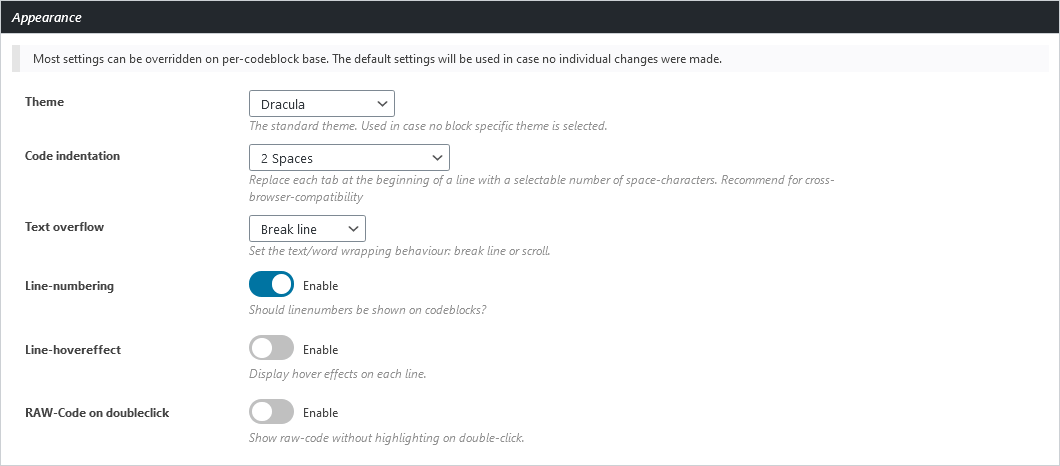
1、开始之前
请确定你的Enlighter使用以下设置,然后再进行下一步操作
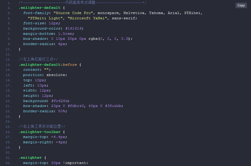
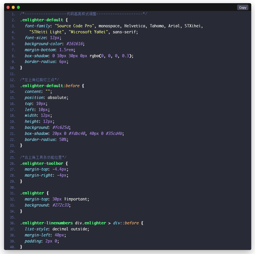
2、优化css
以下是美化所需要的css,在wordpress自定义->额外css加入进去
/*------------------代码高亮样式调整--------------------*/
.enlighter-default {
  font-family: "Source Code Pro", monospace, Helvetica, Tahoma, Arial, STXihei,
    "STHeiti Light", "Microsoft YaHei", sans-serif;
  font-size: 12px;
  background-color: #161616;
  margin-bottom: 1.5rem;
  box-shadow: 0 10px 30px 0px rgba(0, 0, 0, 0.3);
  border-radius: 6px;
}

/*左上角红路灯三点*/
.enlighter-default:before {
  content: "";
  position: absolute;
  top: 10px;
  left: 10px;
  width: 12px;
  height: 12px;
  background: #fc625d;
  box-shadow: 20px 0 #fdbc40, 40px 0 #35cd4b;
  border-radius: 50%;
}

/*右上角工具条功能位置*/
.enlighter-toolbar {
  margin-top: -4.4px;
  margin-right: -4px;
}

.enlighter {
  margin-top: 30px !important;
  background: #272c33;
}

.enlighter-linenumbers div.enlighter > div::before {
  list-style: decimal outside;
  margin-left: 40px;
  padding: 2px 0;
}
</pre>
發佈留言